PROJECT
Integrating the expert advice offer across all channels of the digital ecosystem.
SUMMARY
A distinguishing feature of the German home improvement retailer OBI is that it offers free access to craftsmen who can help with any questions about your home and garden. During the six-month project “scale the ecosystem,” one of our tasks was to combine all expert advice types into one offer that is accessible through our apps and the online shop.
ROLES
Lead Design
Art Direction
User Testing
Strategy
PROJECT
Integrating the expert advice offer across all channels of the digital ecosystem.
SUMMARY
A distinguishing feature of the German home improvement retailer OBI is that it offers free access to craftsmen who can help with any questions about your home and garden. During the six-month project “scale the ecosystem,” one of our tasks was to combine all expert advice types into one offer that is accessible through our apps and the online shop.
INFO
Roles: Lead Design, Art Direction, User Research, Strategy
Platforms: iOS App, Android App, Web Shop
Timeline: January - April 2022
PROJECT
Integrating the expert advice offer across all channels.
SUMMARY
A distinguishing feature of the German home improvement retailer OBI is that it offers free access to craftsmen who can help with any questions about your home and garden. During the six-month project “scale the ecosystem,” one of our tasks was to combine all expert advice types into one offer that is accessible through our apps and the online shop.
INFO
Roles: Lead Design, Art Direction, User Research, Strategy
Platforms: iOS App, Android App, Web Shop
Timeline: January - April 2022
Main Goals
№1 - Combine Journeys
Get an overview of all the advice offers and combine them into a single journey for users to select their preferred advice type from.
№2 - Generate Accounts
Adding a login wall will be essential to achieve the main goal of the “scale the ecosystem” project, which is to generate more customer accounts.
№3 - Manage Requests
It is important that customers who have made a request can easily see its status, find out what steps to take, and have the option to manage their upcoming appointments.
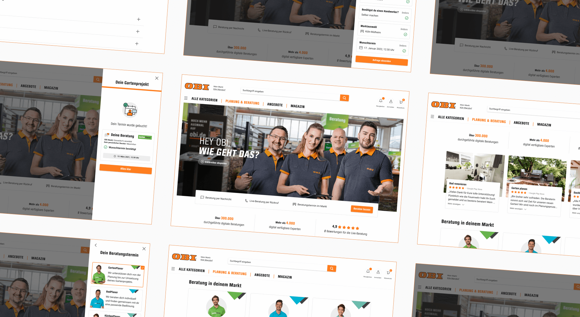
Web designs of the expert advice
Advice Overview
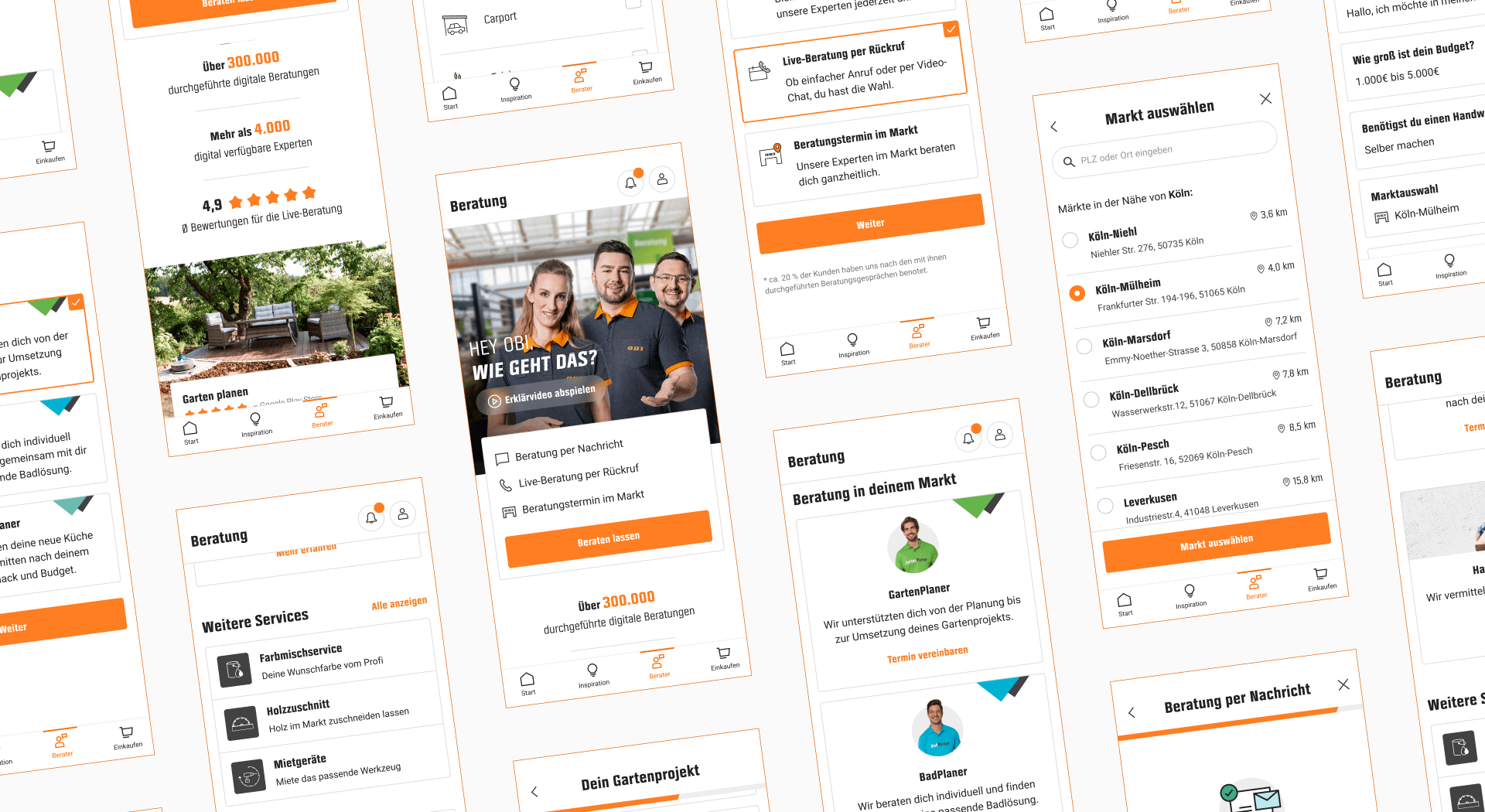
After going through the online shop and app to list anything that could be considered advice, we discussed the results with the product team and defined the various advice types we wanted to integrate into the new concept.
Landing Page
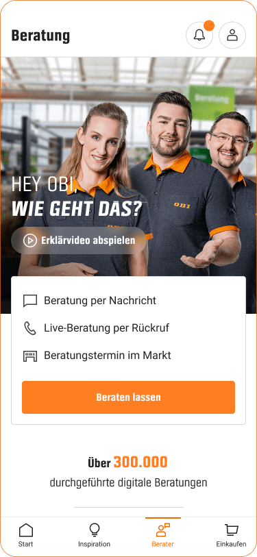
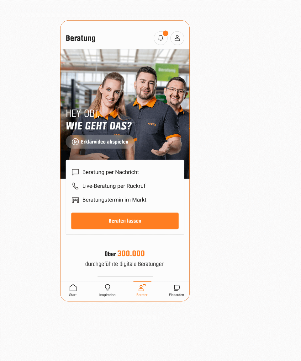
The landing page combines all the features and services related to advice to rapidly provide customers with an overview of how they can get support for their home improvement projects. This page did not exist before, because all the services were spread across different pages.
Scrolling the advice landing page
Header Visual
Having services and experts online as well as in our many stores made it challenging to find a visual that combined them all. After many experiments, we decided to focus on the human aspect. In addition to the visual, we also created a short explainer video.
Part of the explainer video


Advice Journeys
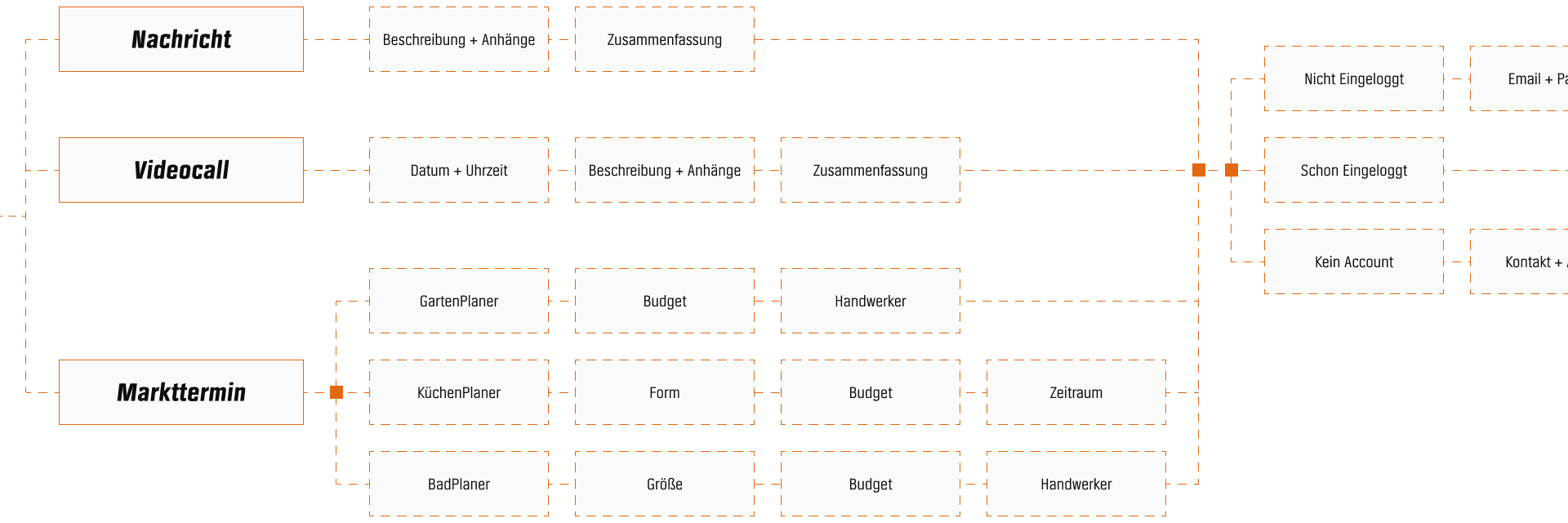
We created task flows for each advice type to explore how the flows can be linked together. We did not change the questions themselves because we planned to run an A/B test for them once live.
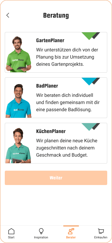
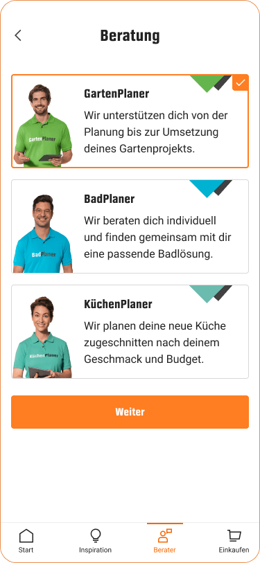
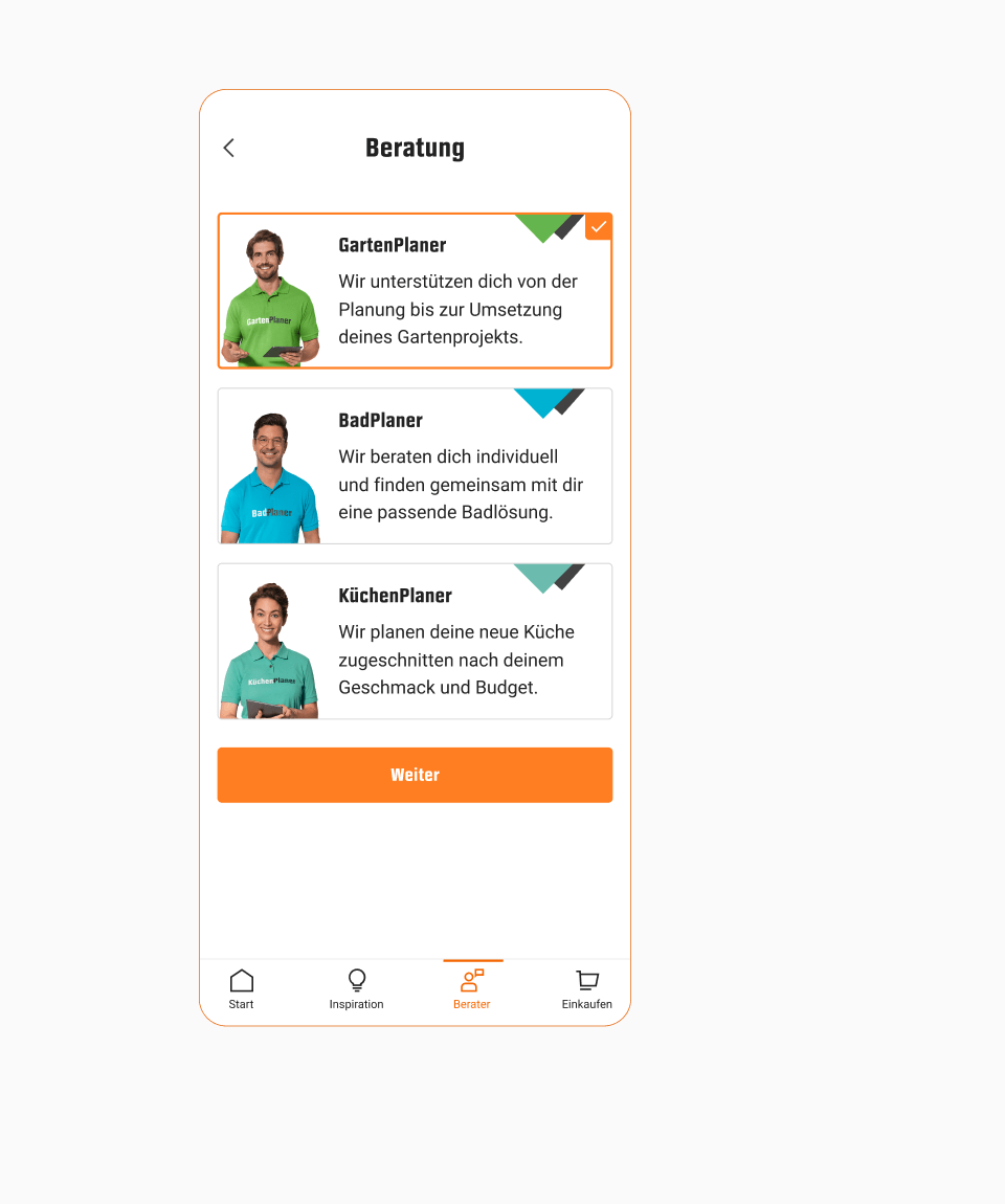
Entry Point
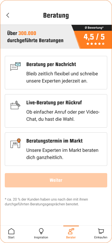
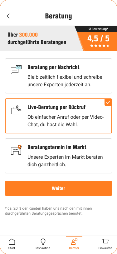
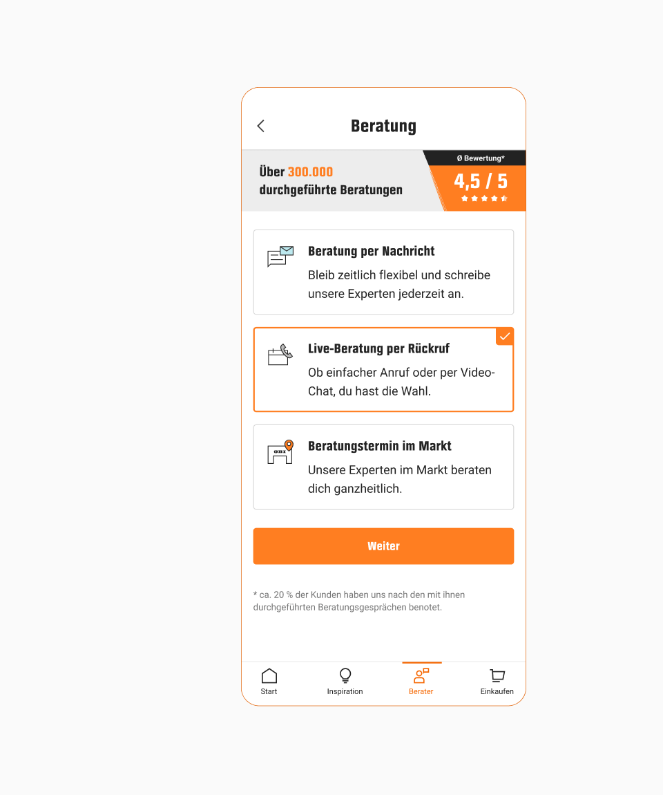
The flow can be started from several pages of the online shop and the app. We included the side-panel pattern that was already used for other features. The first step of the flow gives users the option to choose their preferred advice type. The user interviews helped improve the wording to be as clear as possible.
Opening the side panel
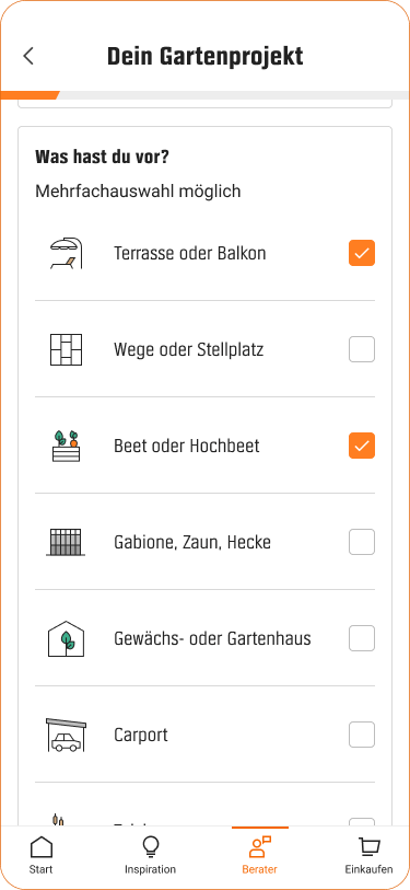
Different Steps
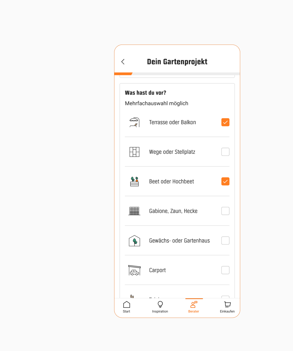
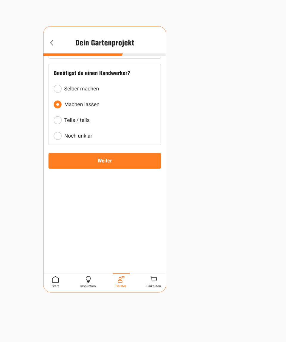
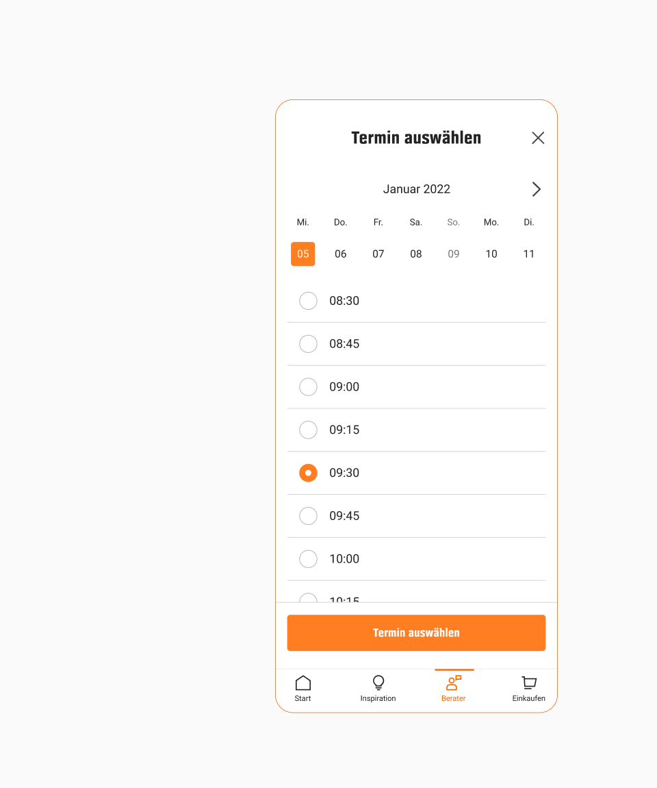
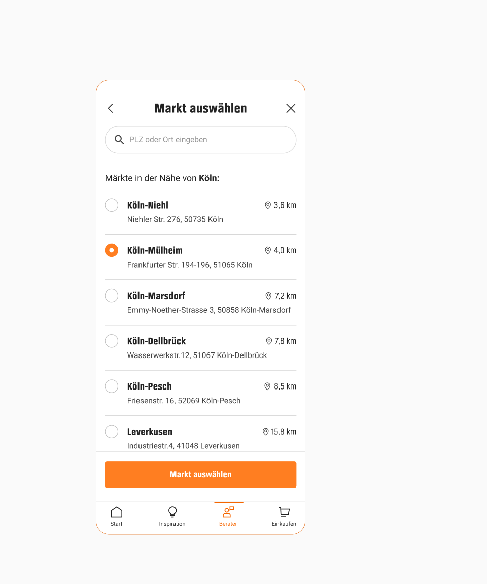
Despite their differences, each advice flow has similar questions, such as the date and store picker. We identified those and created patterns that could easily be reused.
Single selection
Date & time picker
Store picker
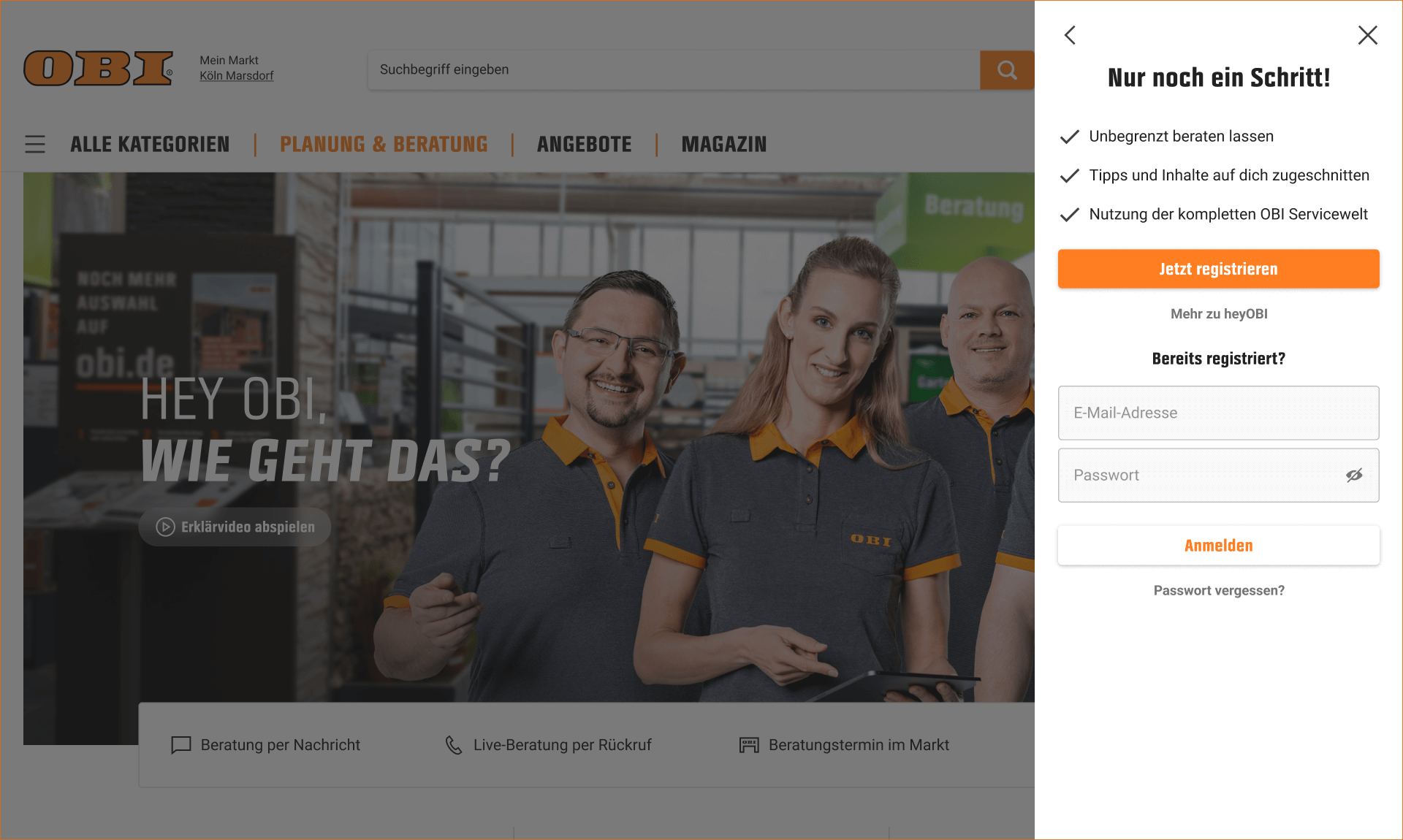
Account Wall
Being part of a bigger project with the goal to generate more customer accounts, it was a deliberate choice to add an account wall into the flow which was created by another team.
Account wall on desktop
Progress Indicators
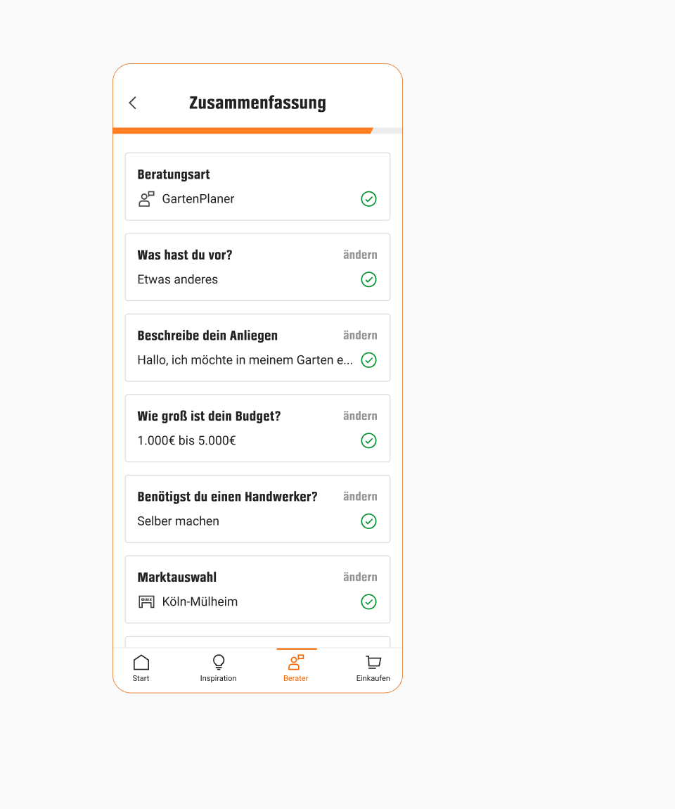
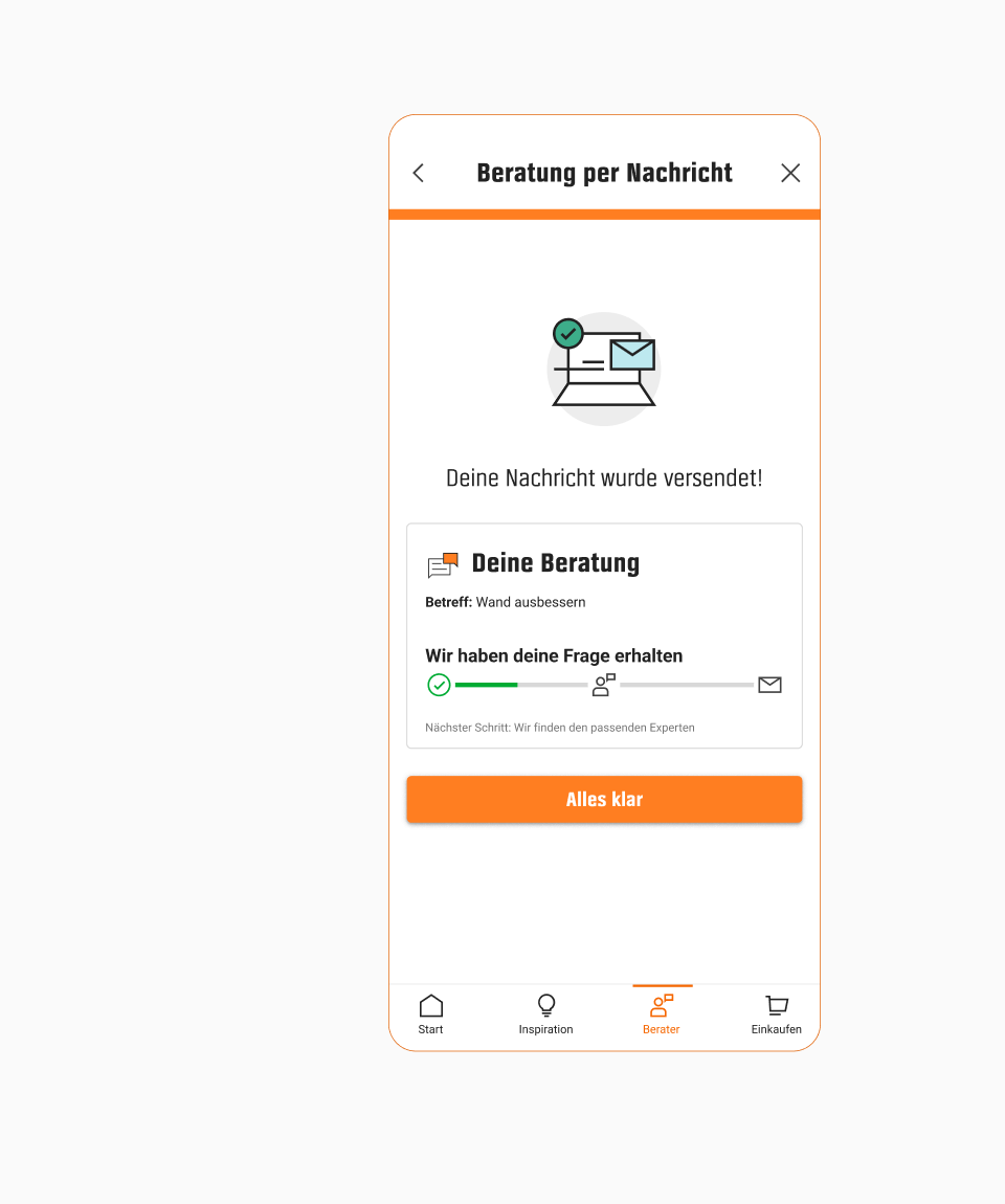
During our research we looked at how other companies managed to keep their users engaged throughout longer flows. Some elements that we found and implemented were a progress bar, the transition between steps, and the summary at the end.
Progress bar & summary
Success state
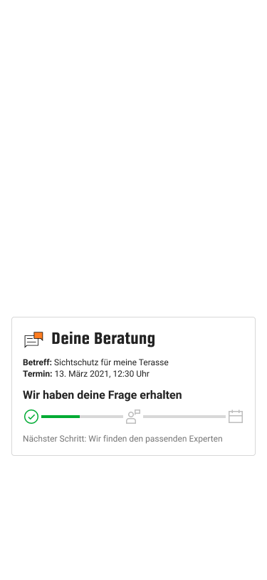
Advice Widgets
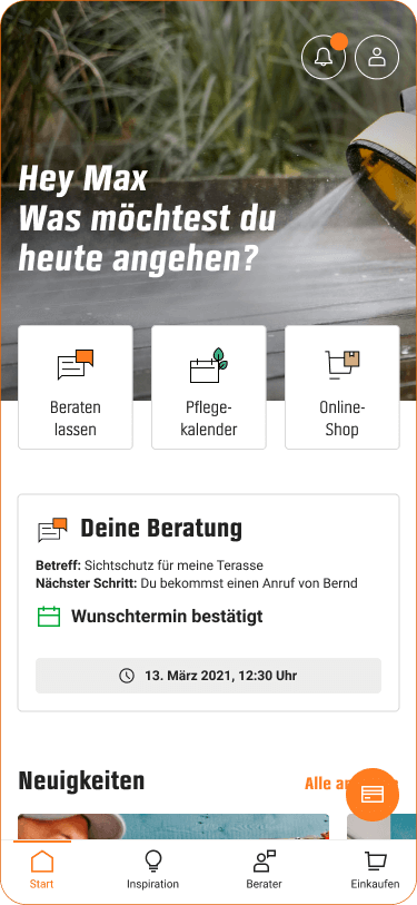
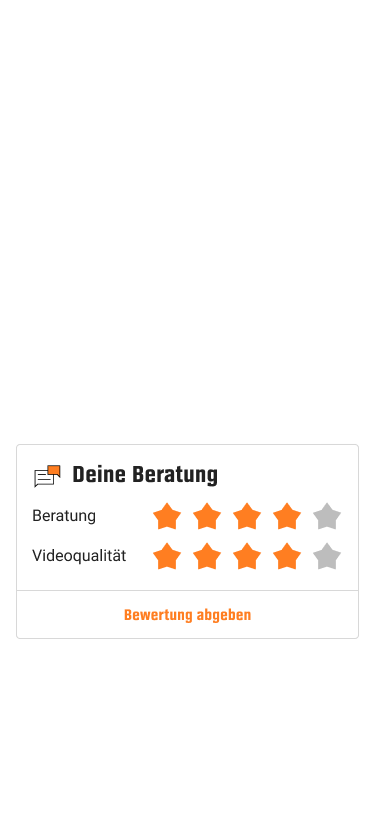
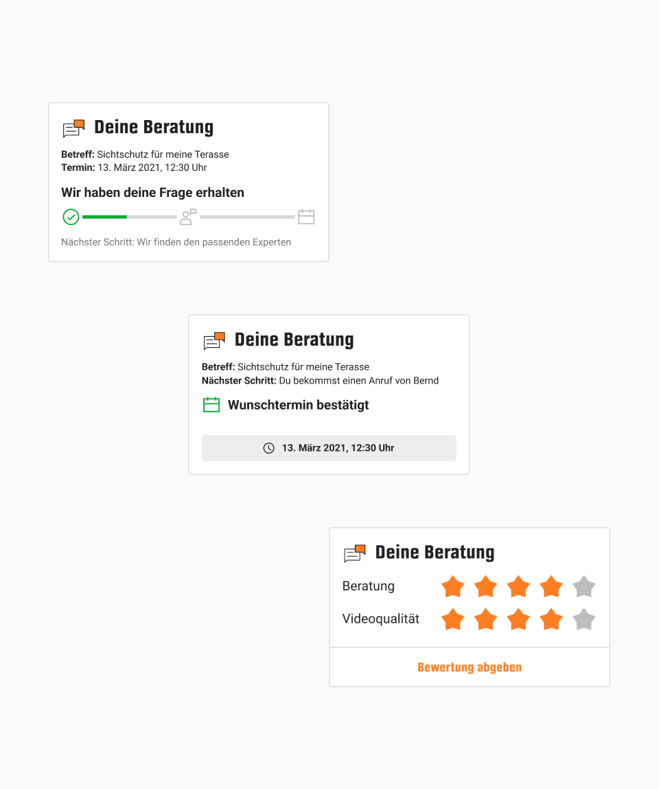
Once customers have made an expert advice request, they should be updated about its status. The widgets we created for the start tab redesign were ideal for that. After listing all the possible states for each advice type, we went on to design the widgets.
Appointments
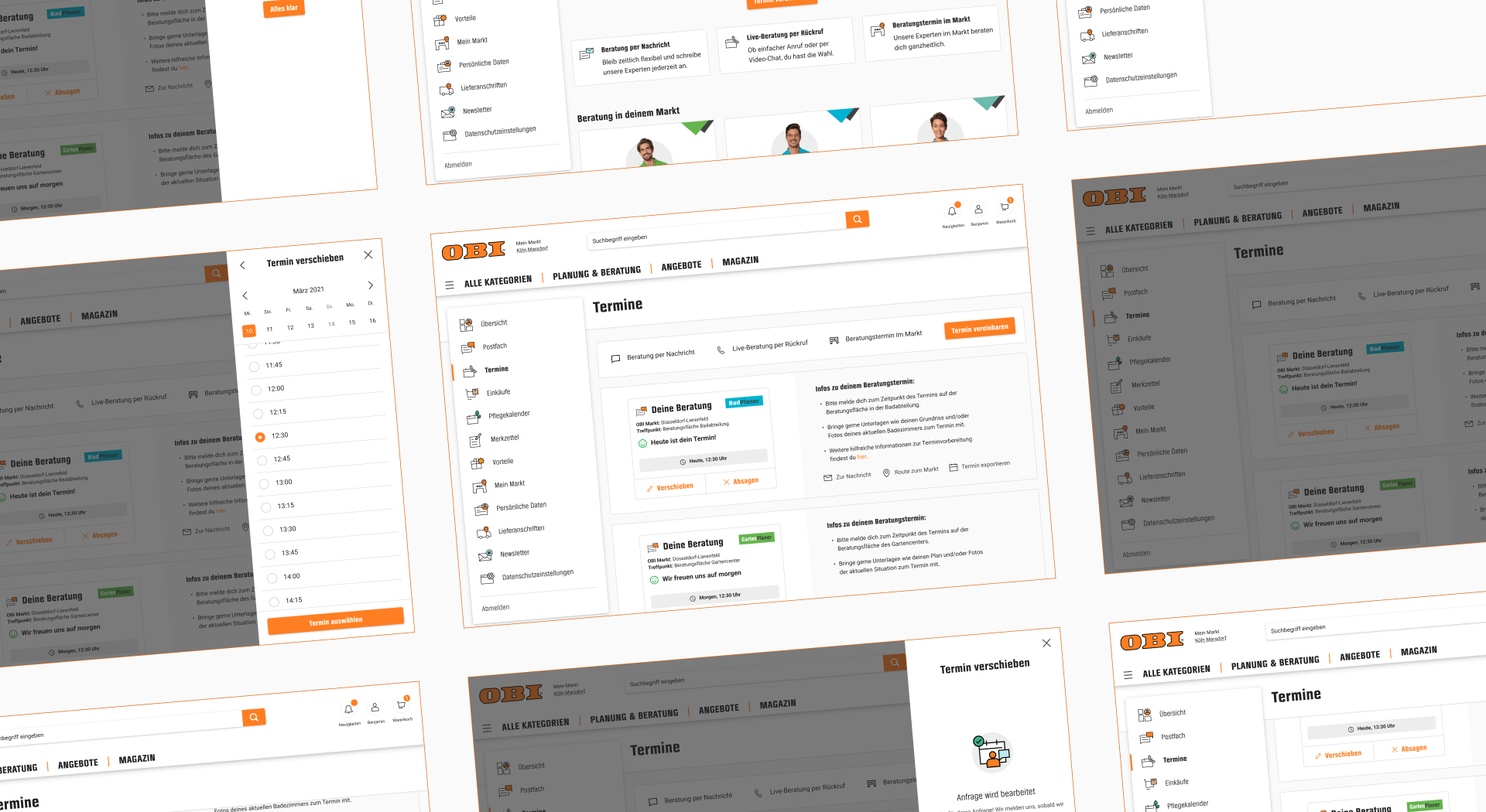
In addition to being updated about the status, users should be able to manage their appointments. A messaging system was already implemented to this end. We added an appointment overview across web and app that gave users relevant information as well as the option to cancel or reschedule.
Appointment overview on desktop
Results
Starting Point
With a compact timeline, our first goal was to combine all the flows into a cohesive experience. Now that this first iteration is live, we can use the new insights to start optimizing the concept.
Store Appointments
Within the first weeks, the percentage of store appointments booked through the app grew considerably, underlining the value of giving users the option to choose their preferred advice type.
Generating Accounts
During the project, the login wall was added into many feature flows, which influenced the conversion rate. The next step is to analyze the insights and start A/B testing different options.
Next Steps
Internally, the redesigned advice concept and flows got a lot of positive attention, which led to stakeholders requesting the redesign of other lead journeys as well.
Takeaways
№1 - Rewarding Project
Even though the project had a tight timeline, it was rewarding to be able to completely redesign an offer across all channels and create a foundation to learn from.
№2 - Team Commitment
During “scale the ecosystem,” a dedicated team of 40 people across the company had six months to bring the vision to reality. This commitment helped us to make decisions and move quickly.
№3 - Power of Wireframes
To enable development teams to start with the groundwork, we used wireframes to test and present concepts early in the process.
№4 - Time Constraints
Even though we had to deliver five features within six months, we made sure to always do at least one round of user interviews and use the insights generated from past projects.
Create Impact!
Create Impact!
Create Impact!
Create Impact!
Create Impact!
Create Impact!
Create Impact!
Create Impact!
Create Impact!
Create Impact!
Create Impact!
Create Impact!
