PROJECT
Redesigning the heyobi start tab to better guide our customers along their journey.
SUMMARY
OBI, the German multinational home improvement supplies retailing company, launched its heyOBI app in 2019. It offers a variety of features that support customers throughout their projects. After years of adding new features to the app, which had reached over one million downloads, I initiated the redesign of the start tab to realign our main entry point to the long-term product vision.
ROLES
Lead Design
Initiate Project
User Research
Strategy
PROJECT
Redesigning the heyobi start tab to better guide our customers along their journey.
SUMMARY
OBI, the German multinational home improvement supplies retailing company, launched its heyOBI app in 2019. It offers a variety of features that support customers throughout their projects. After years of adding new features to the app, which had reached over one million downloads, I initiated the redesign of the start tab to realign our main entry point to the long-term product vision.
INFO
Roles: Lead Design, Initiate Project, User Research, Strategy
Timeline: March - December 2021
Platforms: iOS App, Android App
PROJECT
Redesigning the heyobi start tab to better guide our customers.
SUMMARY
OBI, the German multinational home improvement supplies retailing company, launched its heyOBI app in 2019. It offers a variety of features that support customers throughout their projects. After years of adding new features to the app, which had reached over one million downloads, I initiated the redesign of the start tab to realign our main entry point to the long-term product vision.
INFO
Roles: Lead Design, Initiate Project, User Research, Strategy
Timeline: March - December 2021
Platforms: iOS App, Android App
The redesigned start tab
Main Goals
№1 - Discoverability
Develop a better understanding of the overall customer journey to make relevant features easily discoverable at the right moment.
№2 - Shift Perception
Shift the initial perception customers have about the app being a traditional shopping app to being a digital companion supporting their home improvement journey.
№3 - Scalability
Use scalable navigation patterns, establish rules and a logic for the placement of new features to avoid having to restructure the app every couple of months.
The redesigned inspiration tab
Visual Update
Our team was in the process of creating an overall design system for all customer-facing products. However, we decided to take the opportunity to first implement foundational aspects such as the typography, colors, icons, and spacings.
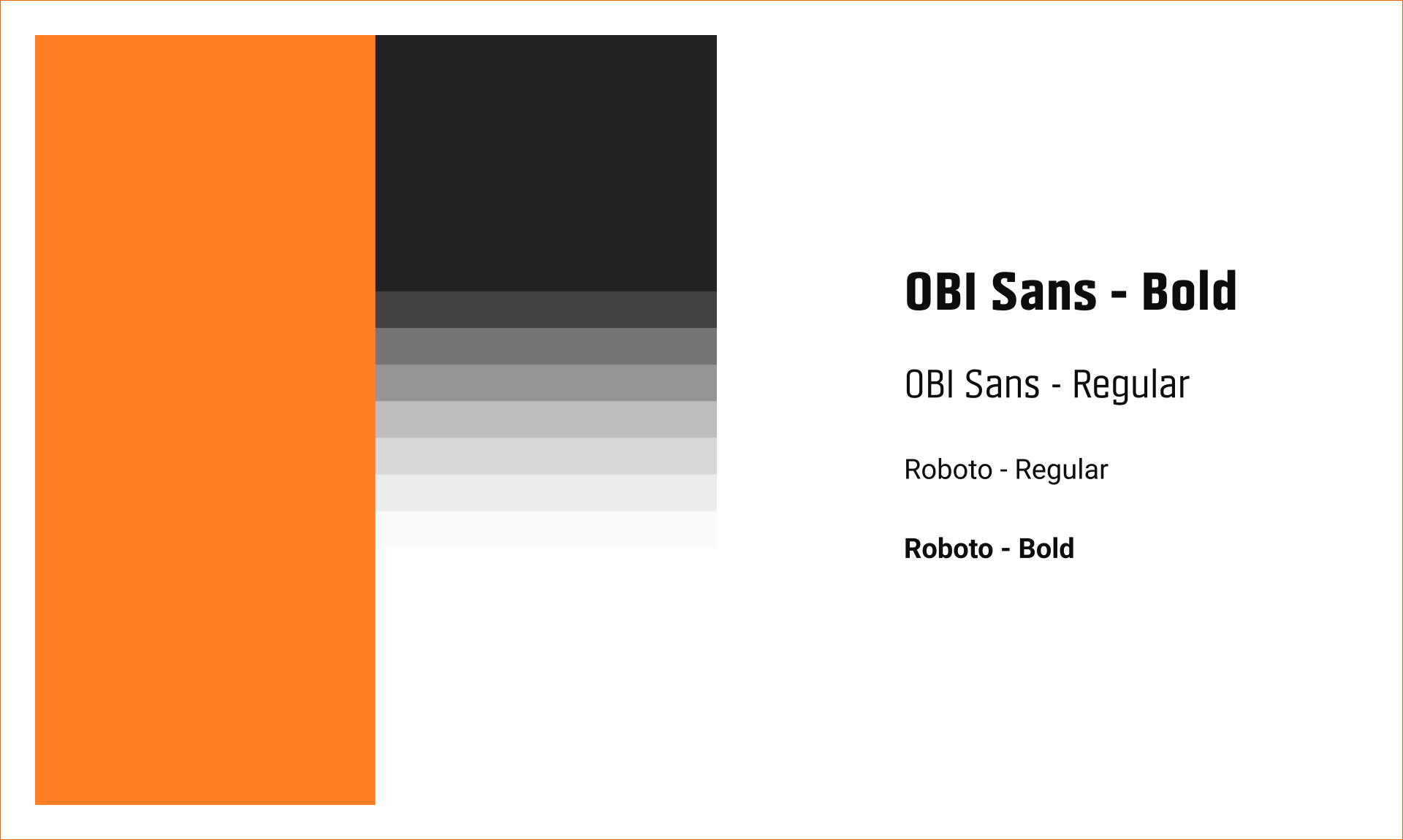
Typography and color choice
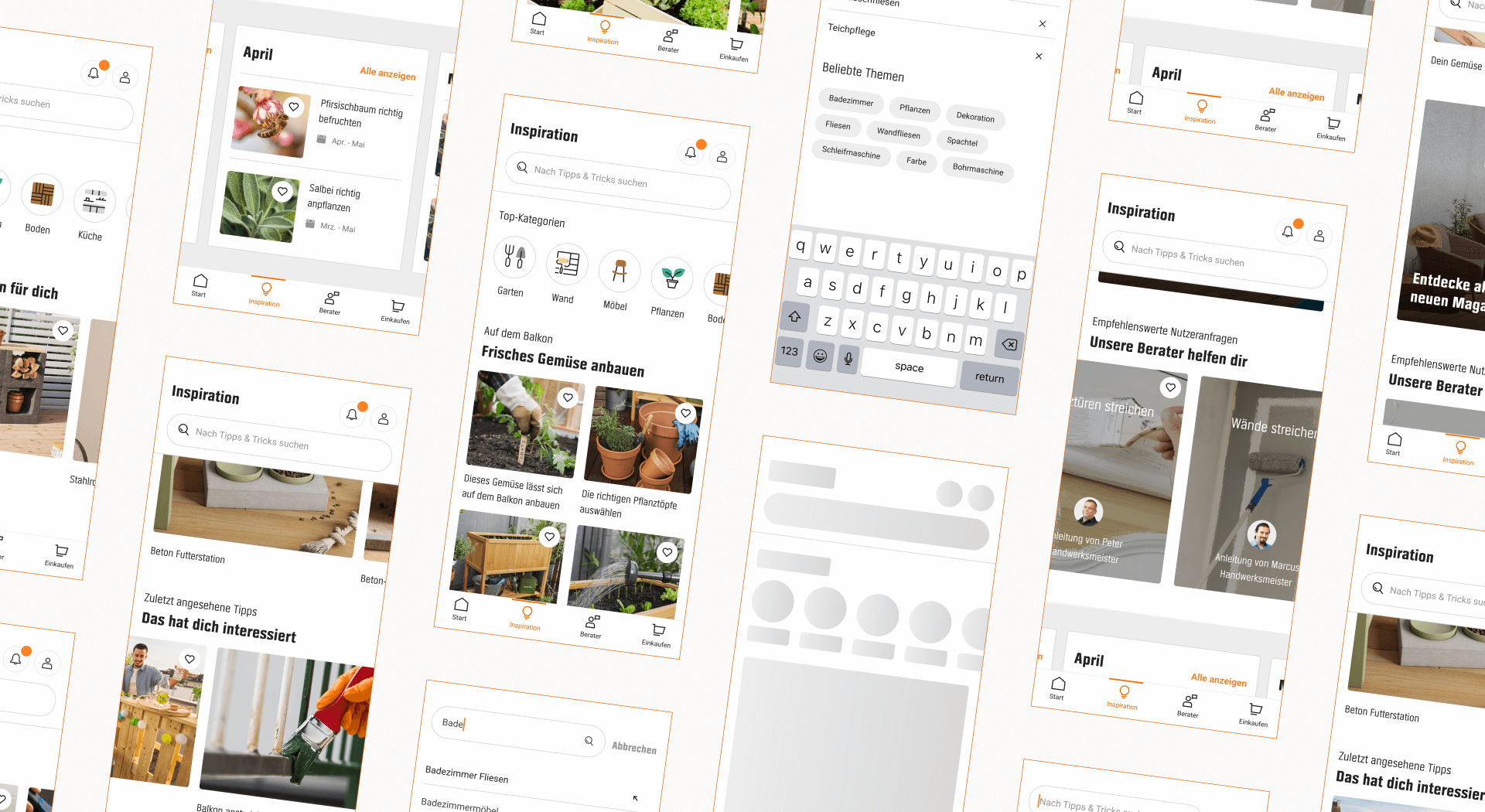
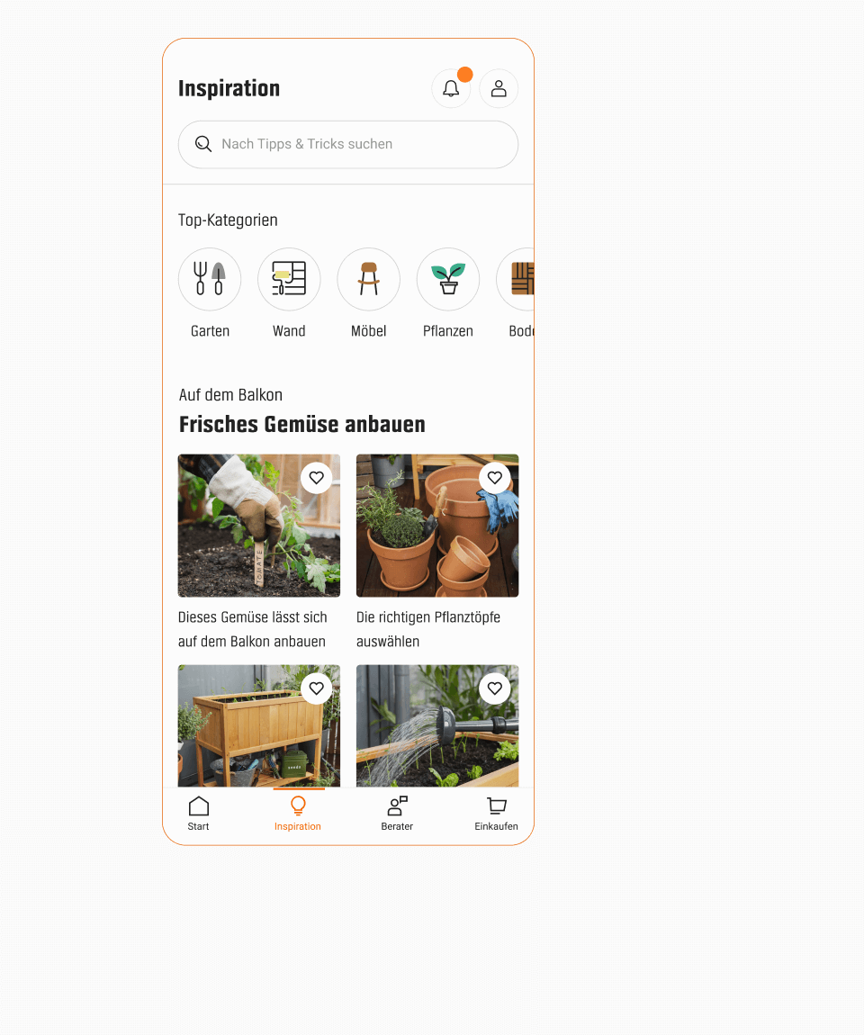
Inspiration Tab
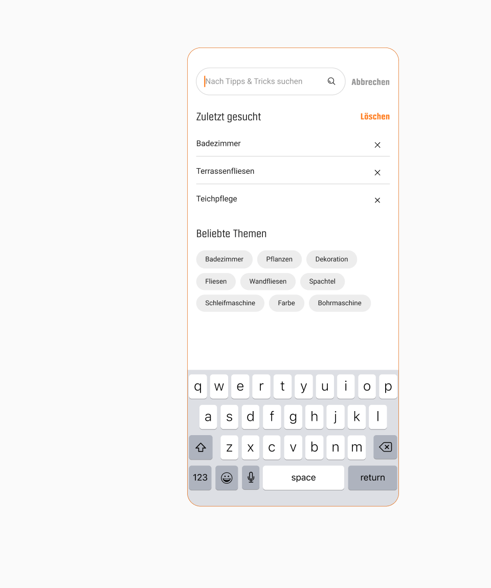
In the previous version of the app, the content was split between the start and inspiration tab, which was very confusing. To fix this, we gathered all the content under the inspiration tab and added a content search and filters for easier navigation.
Scrolling through content
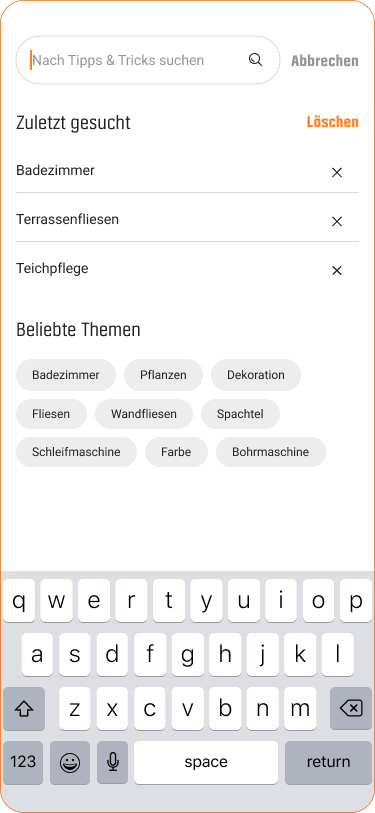
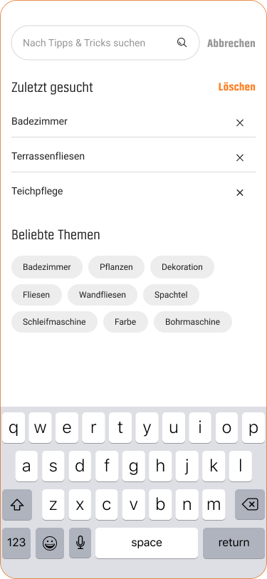
Content search


Prioritization
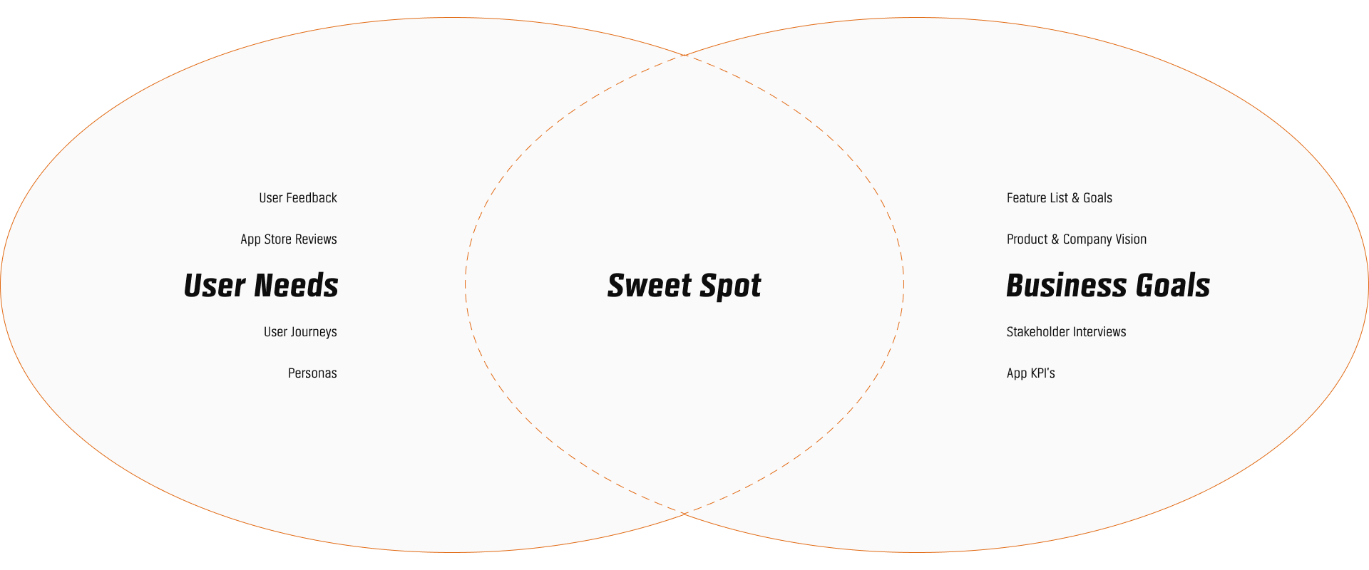
By analyzing and overlapping the user needs and business goals, we identified the features that should be easily discoverable when opening the app.
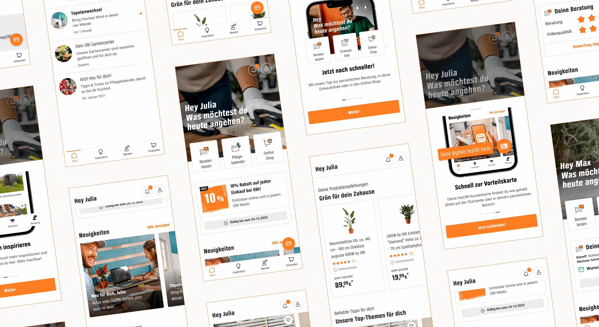
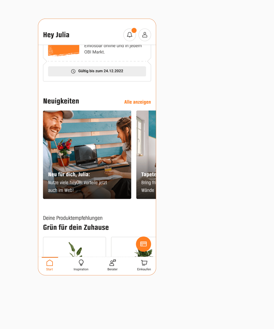
Start Tab
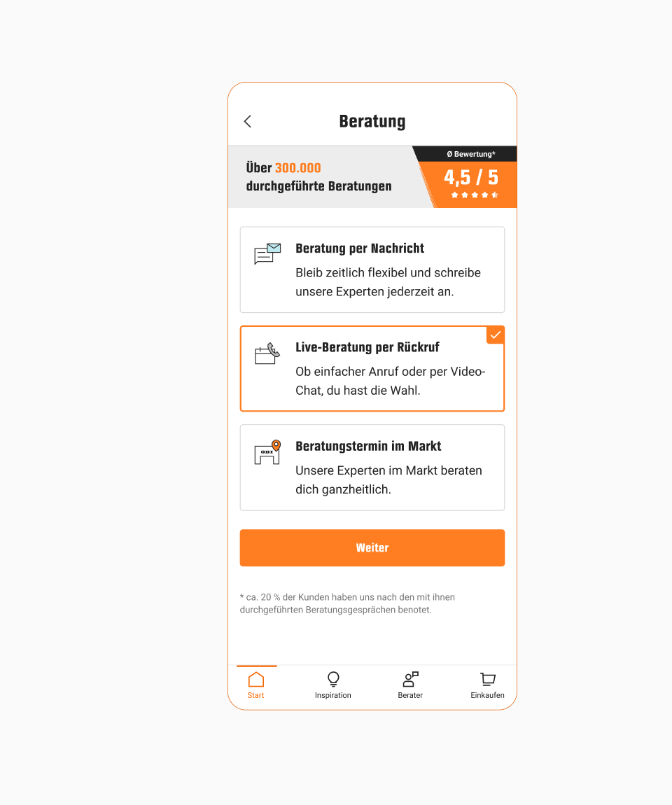
Using the insights from a closed card sorting and the list of prioritized features, we built different sitemaps that combined mobile app navigation patterns with features. We then built three prototypes, which we tested in user interviews.
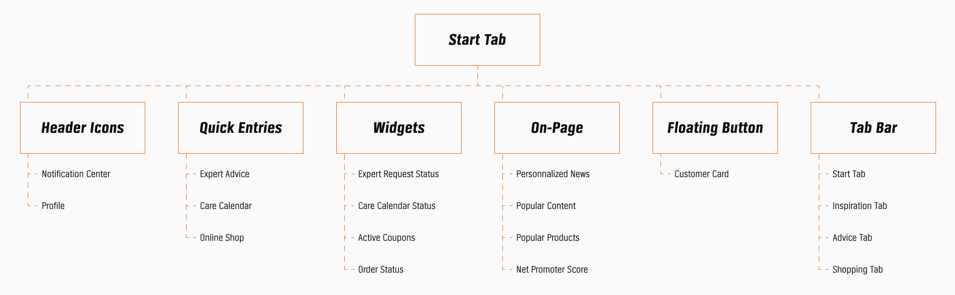
Structure
As the start tab is the main entry point of the app, the new design supports users along their home improvement journey by making relevant features easily discoverable at the right moment.
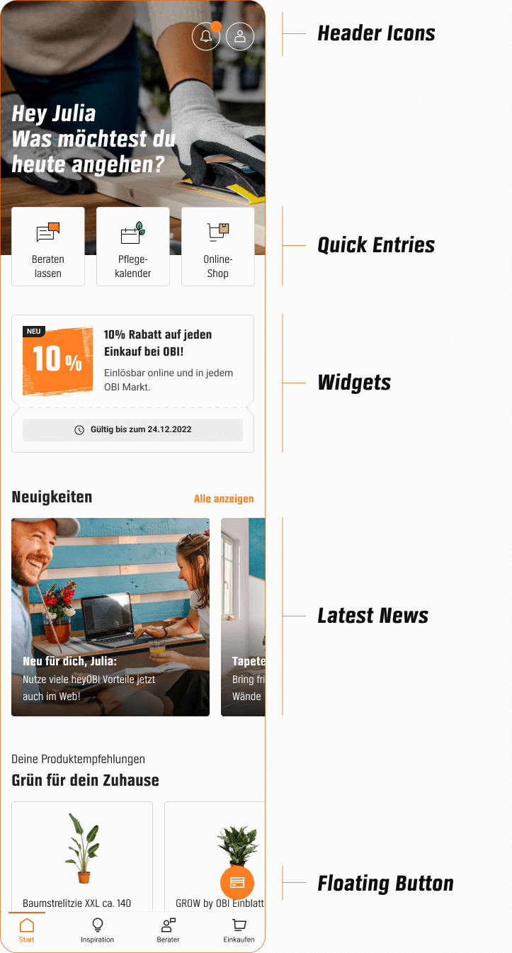
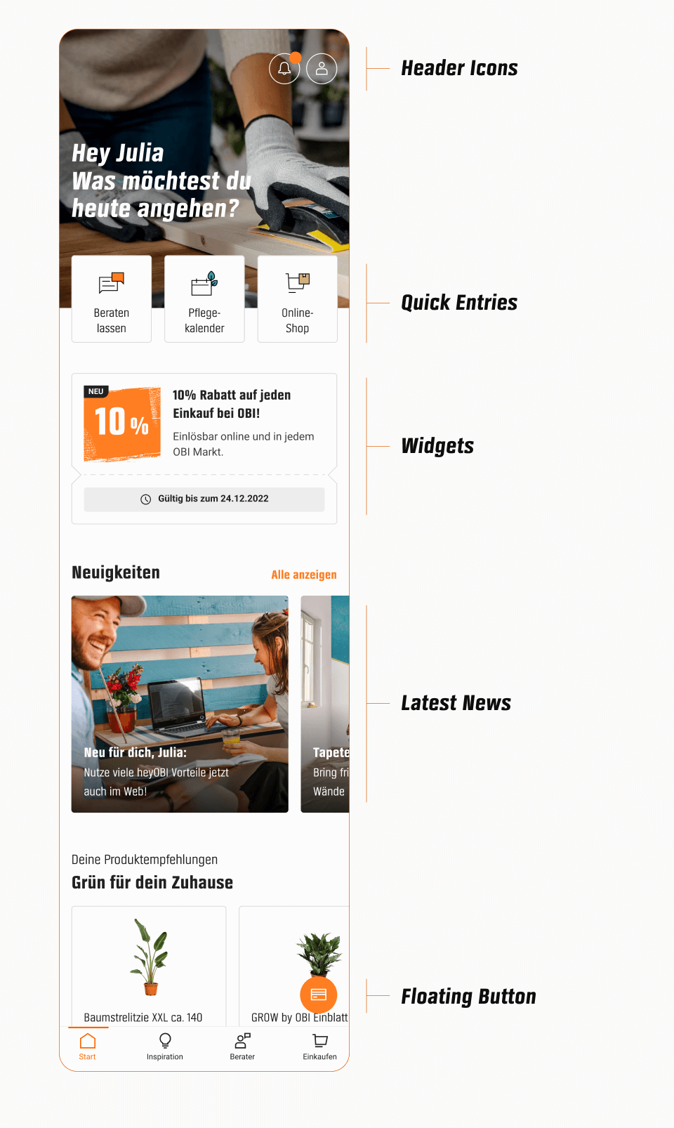
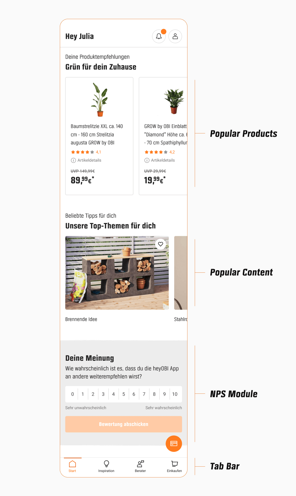
Quick Entries
Being right in the field of view, the quick entries are in the ideal place for important features. As the online shop is the most used feature, we placed it there to ensure ease of access for users.
Care calendar quick entry
Expert advice quick entry
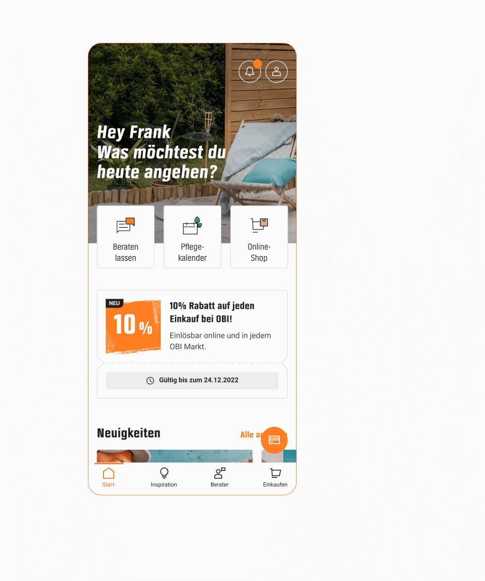
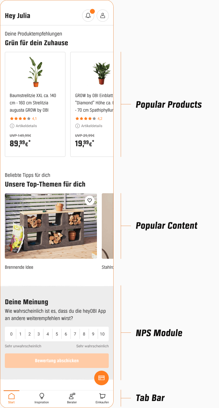
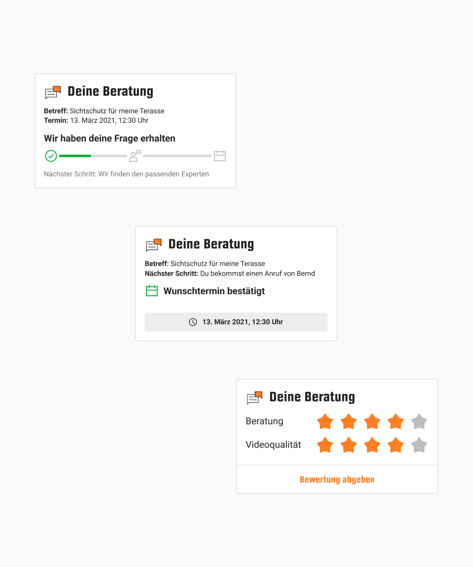
Widgets
Our research has shown that users frequently open the app while they are engaged in a journey. In light of this, I came up with the idea of designing widgets to make jumping back into their journey more convenient. The widgets are displayed on the start tab as long as they are relevant.

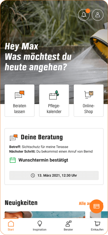
Widget states

Widget states
News Slider
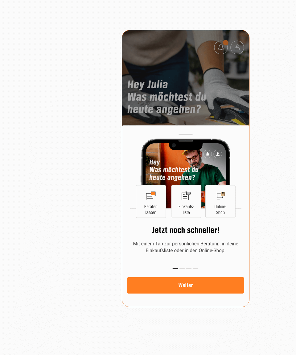
Our CRM team puts a lot of effort into sending out personalized news to our users. To make these items more appealing, we decided to incorporate larger visuals. We also created a short onboarding to explain the redesign of the start tab.
Visual news slider
Redesign onboarding
New Channel
The concept of the start tab was implemented one year later on the home page of the online shop in order to boost this perception shift across all channels and get one step closer to a digital ecosystem.
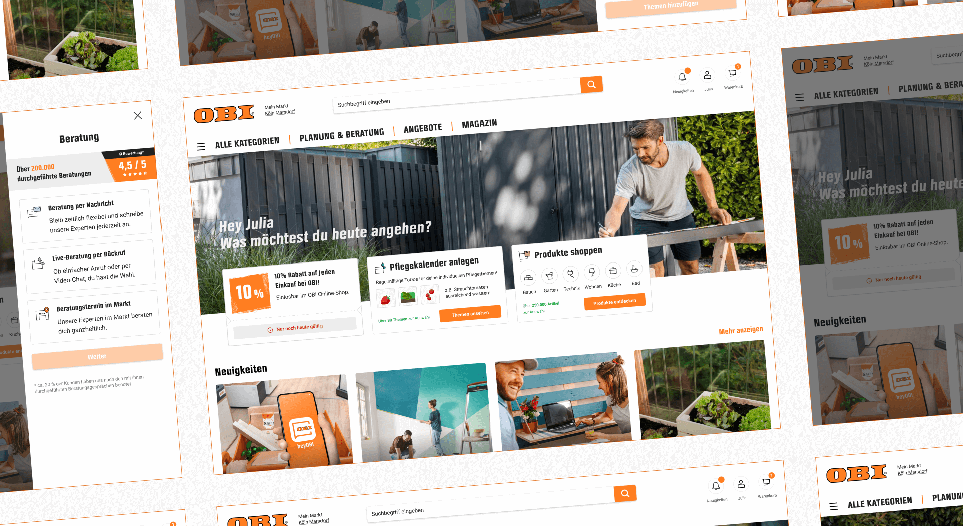
The new home page of the online shop
Results
Perception Shift
During user interviews of the new start tab, interviewees who were expecting a traditional shopping experience rapidly understood that the app offers many more features for their projects.
More Entries
The three quick entries were adopted from day one and worked as expected, directing a lot of traffic to the different main journeys and making them more discoverable.
More Views
The redesigned news module with more prominent visuals led to a higher opening rate of the personalized messages sent out by the CRM team.
App Rating
The iOS and Android app rating grew by 0.1 points to 4.6 out of 5 stars. Many factors could have influenced this, but it was a good sign that the rating had not been negatively affected by such a big change.
Takeaways
№1 - Take Initiative
It was a great feeling to have an impact on the product with a self-initiated project that required a lot of internal convincing to begin with. Despite the challenges, it was worth it.
№2 - Step by Step
At first, the task seemed endless and not very distinct. It was helpful to approach the topic step by step and focus on what was feasible with the available resources.
№3 - Early Involvement
Changing such a crucial part of the app meant making changes to features that are owned by various stakeholders. Getting them involved early on helped ensure their buy-in.
№4 - Holistic Thinking
It was easy to get lost in small details and expectations of every stakeholder. It was important to keep the overall perception of the product constantly in mind.
Create Impact!
Create Impact!
Create Impact!
Create Impact!
Create Impact!
Create Impact!
Create Impact!
Create Impact!
Create Impact!
Create Impact!
Create Impact!
Create Impact!